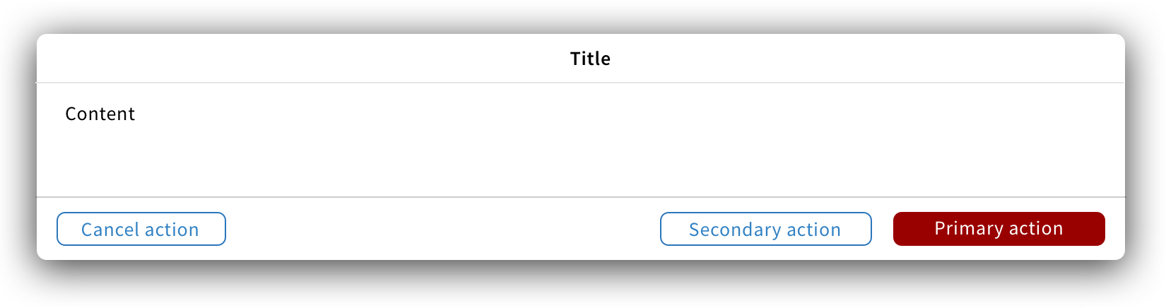
Modal component
A modal is a container triggered by a user’s action to give critical information about the action, to ask the user to take a decision or to add content.
Structure
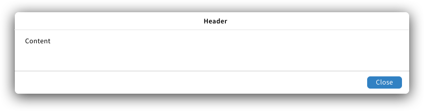
A modal is a non-dismissible window with a header, content and, at least, one button to close the modal.
Title
The title should be a short, descriptive and clear statement.
Content
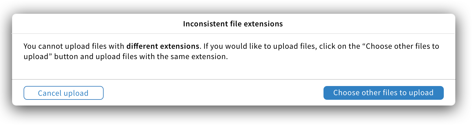
The content gives users information about the action they performed and what will happen if they proceed with the action. Below are the 3 main rules to follow while writing modal content:
- Key information should be bold.
- Give a solution to users if there is an issue.
- Content should be short. To add information while avoiding scrolling, a “More info” button can be added.

For modals linked to bulk actions, users should see:
- A summary (top left) showing how many items weren’t successful versus how many were.
- A scrollable list with details information about each item involved in the action.

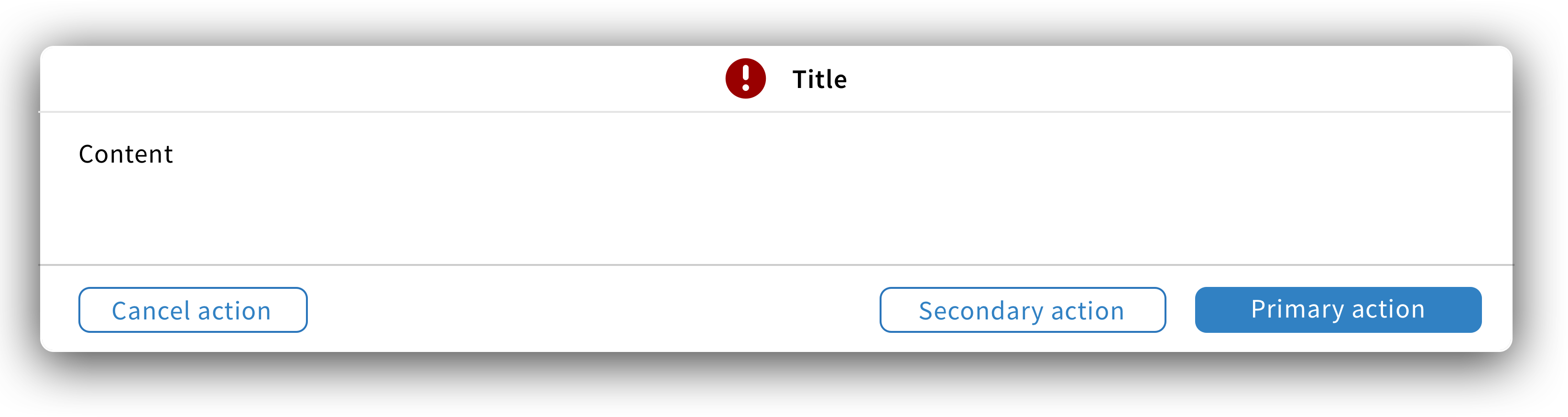
Buttons
Since modals are not dismissible, they should always have at least one primary button in the bottom right to close the modal and it shall be labelled “Close”. If more buttons are needed, they should be in the default style with the cancel action on the left.
Labels should be short but descriptive.


If the modal states an issue, provide a button to allow users to fix the issue and label it accordingly.
Choosing a primary button
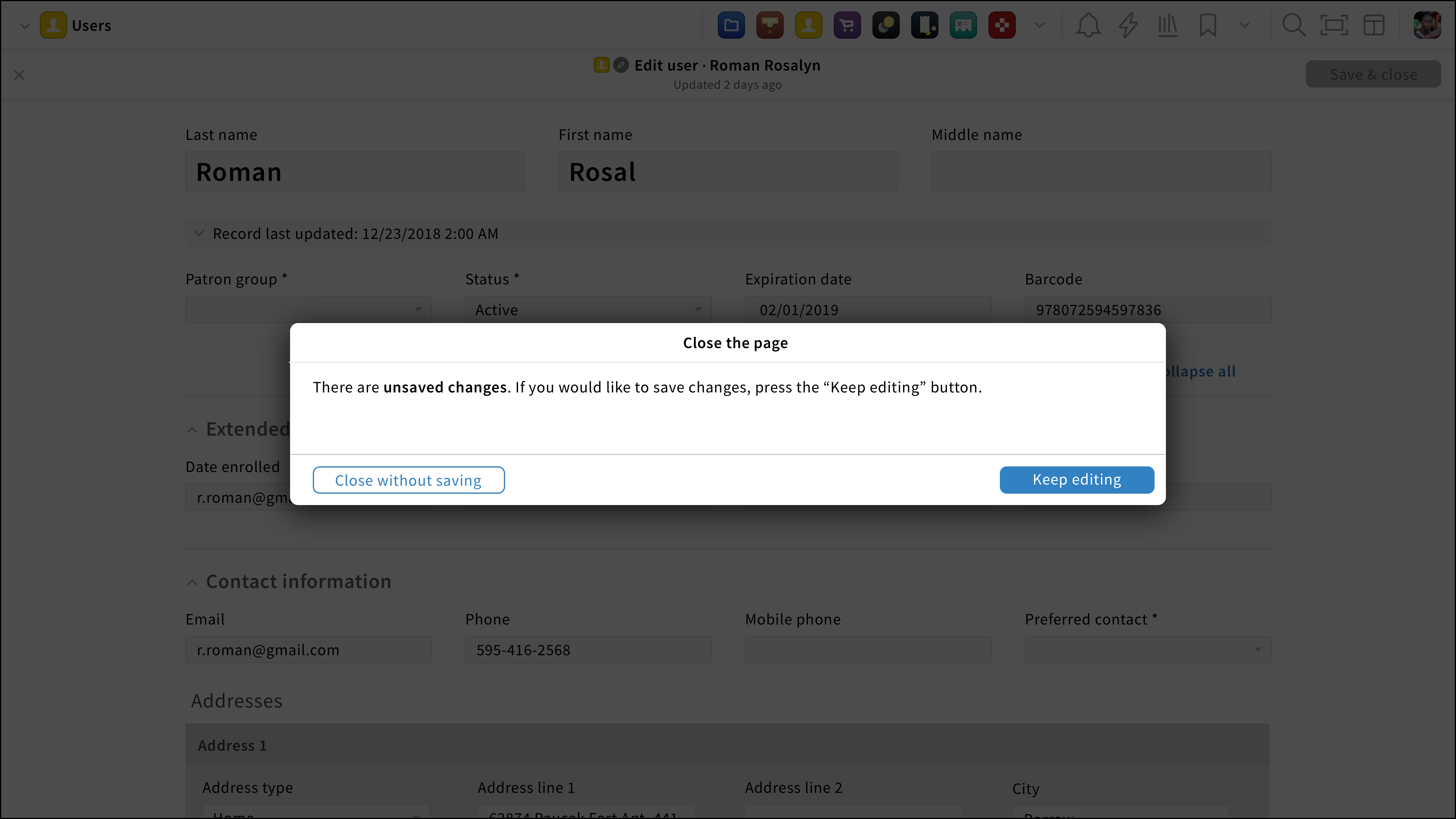
The primary button should translate what action has been attended by the user. If no explicit action triggers a modal, the primary button should be the safer choice. For instance, the “Close the page” modal appears when users click on a navigation icon without closing an edit/create page. In here, no explicit action to close the page has been performed by the user therefore, the “Keep editing” button (safer choice) is the primary button.

Size & location
Modals should appear at the upper half of the screen and they shouldn’t take more than 50% of the screen.
Behavior
When a modal appears, it interrupts a user’s current task to catch its full attention.
Since modals display important information, they aren’t dismissable, users consciously dismiss them by clicking on the close/cancel button or choosing another action.
Style
Modals can have 4 different states: Default, error, success and danger.


Specific modals
Add quick content UX pattern
Also referred to as: Add modal; Add content modal; Quick add;