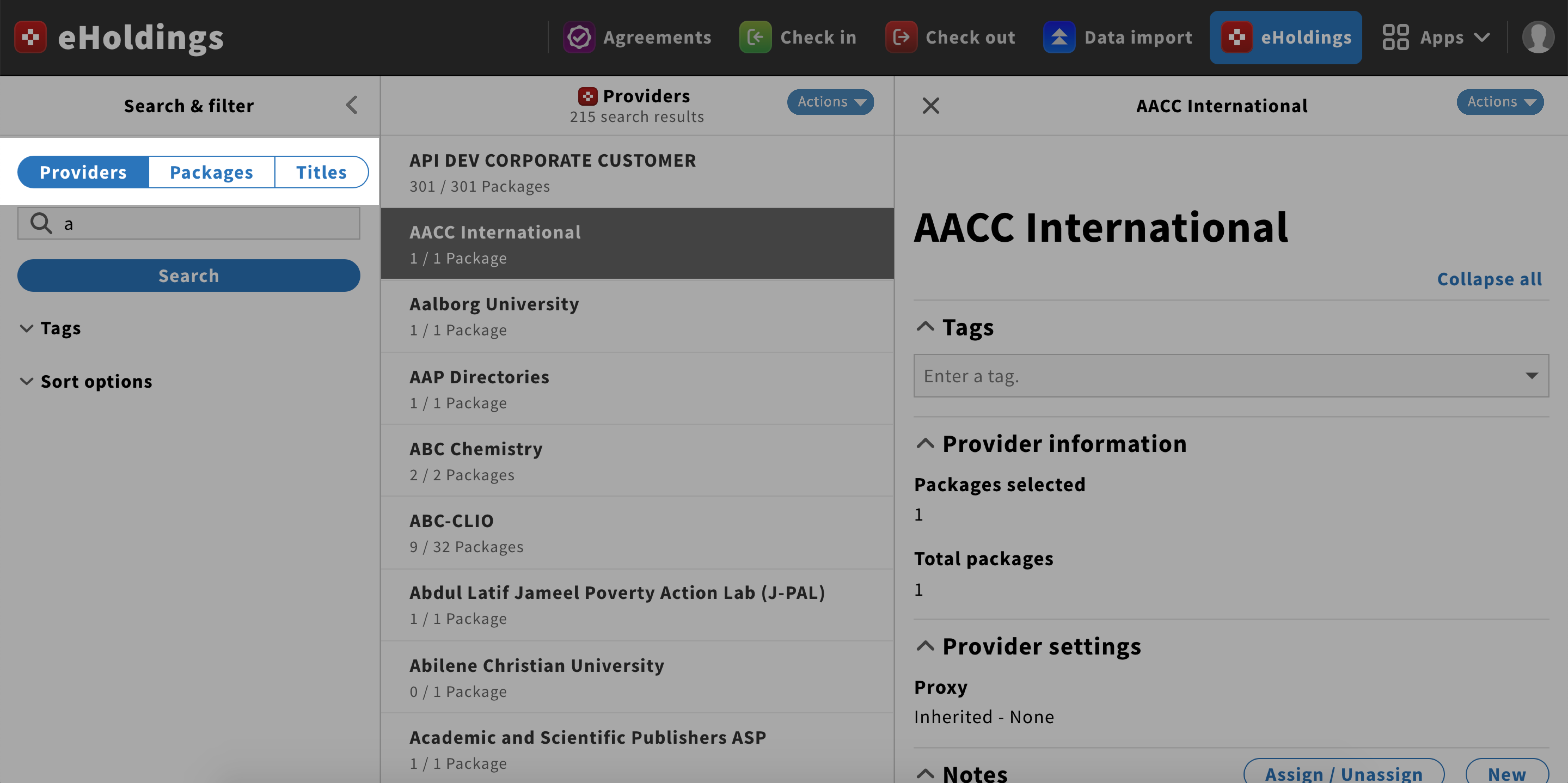
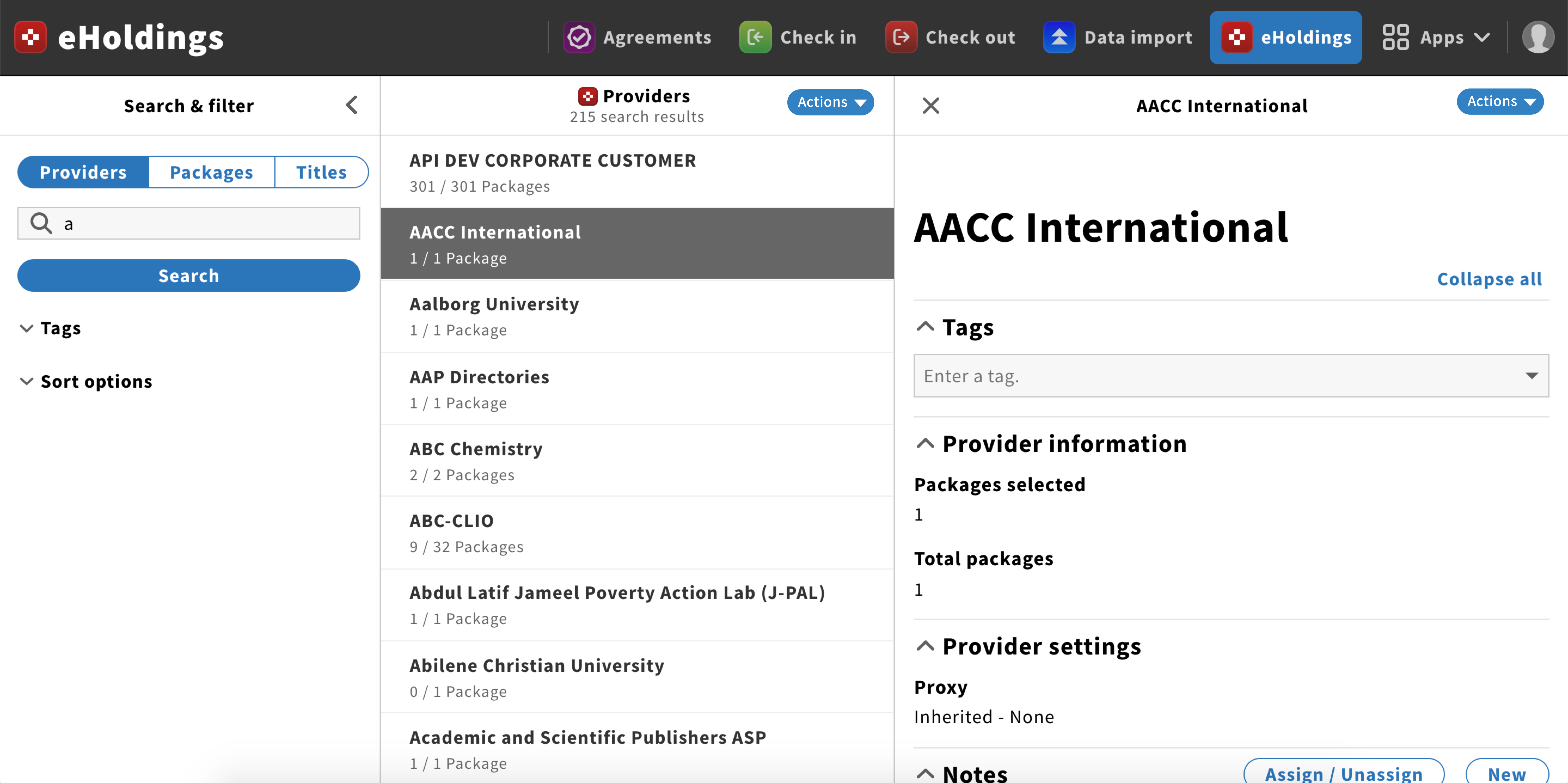
Button group component
Button groups can be used for filters, tabs, and other sub-navigation.
Structure
Button groups are a set of buttons.
They should have one primary button and the rest in a default style.
Behavior
Button groups should always be placed above the content that they acts on.
The content display should be the one associated with the primary button.
This button group acts on of the Search & filter pane only


