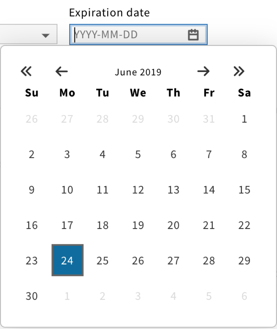
Datepicker component
A datepicker allows users to pick a date from a small overlay.

Structure
A Datepicker is a text field with a calendar icon on the right.
While FOLIO avoids using placeholders for text fields, Datepickers are an exception to the rule.
The following placeholder shall be displayed: “YYYY-MM-DD”.

For a required datepicker, a red asterisk should be added next to the label.

For a read-only datepicker, a lock icon should be added next to the label.

Behavior
When users click on a datepicker, the field becomes active and a calendar overlay should appear.
When users pick a date, the calendar should disappear.
The datepicker should have the selected date as well as a clear X icon in addition to the calendar icon.

Style
Since datepickers are clickable elements, they have multiple states.
Each state is associated with a different color, providing visual feedback to users.