Timepicker component
A timepicker allows users to pick a time from a small overlay.
Structure
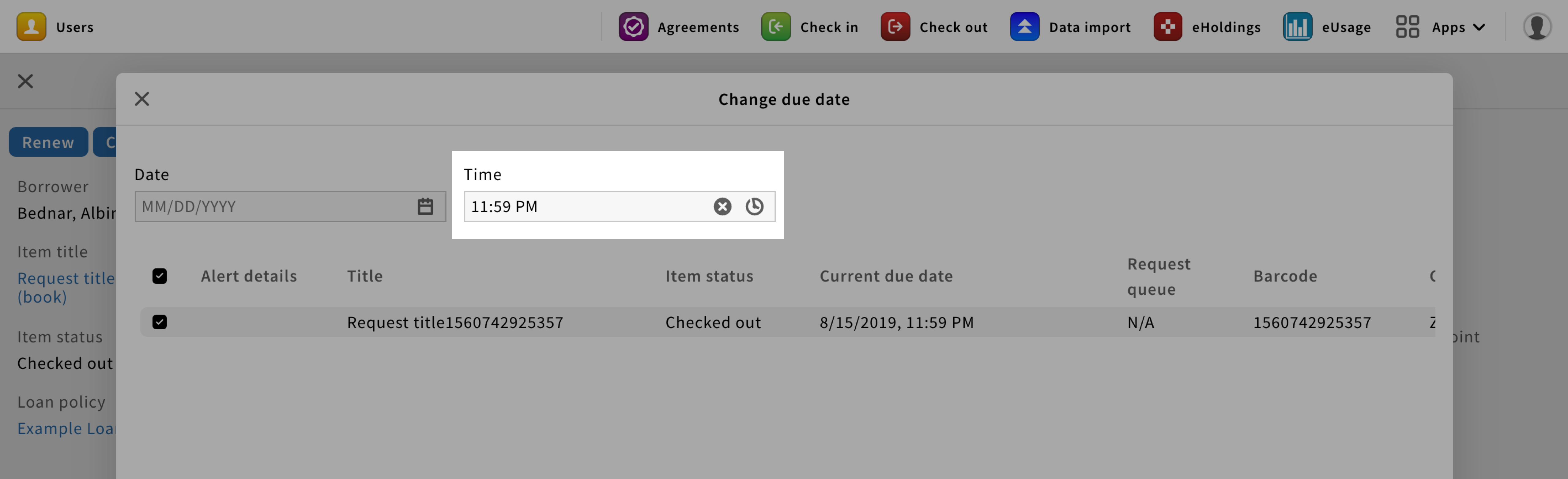
A timepicker is a text field with a clock icon on the right.
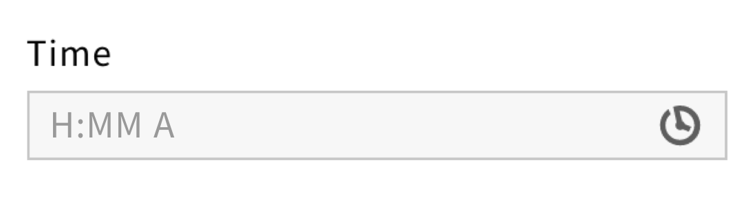
While FOLIO avoids using placeholders for text fields, timepickers are an exception to the rule.
The following placeholder shall be displayed: “H:MM A”.
For a required timepicker, a red asterisk should be added next to the label.

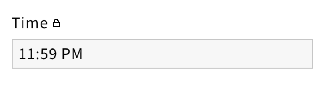
For a read-only timepicker, a lock icon should be added next to the label and no clock icon should be displayed in the field.
Behavior
When users click on the timepicker, the field becomes active and a clock overlay shall appear.
From the overlay, users can select hours and minutes by using the arrows or the text fields. They can also, switch between PM and AM, by clicking on the default style button.

When a time is selected, users should click on the “Set time” primary button to save the selection. The overlay should then disappear and the timepicker should have the selected time as well as a clear X icon in addition to the clock icon.
Style
Since datepickers are clickable elements, they have multiple states.
Each state is associated with a different color, providing visual feedback to users.
