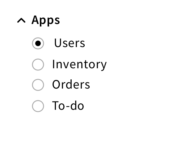
Radio button component
A radio button allows users to select one option from a set.
Structure
A radio button is a small square that can be checked or unchecked.
It can have a label placed on the left (inline) or on top (vertical).
For a required radio button, a red asterisk should be added next to the label.

For a read-only radio button, a lock icon should be added next to the label.

Behavior
Clicking on a radio button selects an item. A dot appears inside the radio button to confirm the selection.

Style
Color
Since radio buttons are clickable elements, they have multiple states.
Each state is associated with a different color, providing visual feedback to users.

Shape
Radio buttons are shown as a small circle with a 1px outline and a dot when selected.
