Select component
A select field allows users to select one option from a list of more than 10 items.

Structure
The select field is a type of text field with a down arrow icon on the right.
Generally, it has a label which indicates the type of input associated with the field.
Be aware: Placeholders should be avoided.
Good example
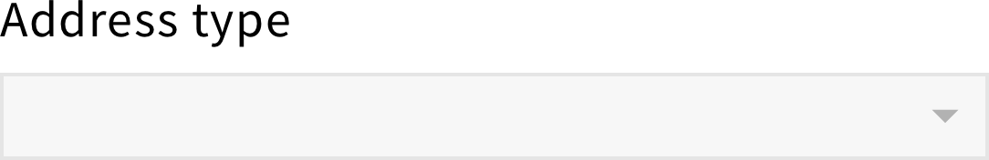
Select field with no placeholder
Bad example
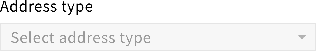
Select field with placeholder
For a required select, a red asterisk should be added next to the label.

For a read-only select, a lock icon should be added next to the label.

Behavior
When users click on a select field, a dropdown window appears with a set of options.
When users click on an option, the dropdown should disappear and the selection should be visible in the field.
Style
Color
Since the select field is a clickable element, it has multiple states. Each state is associated with a different color, providing visual feedback to users.