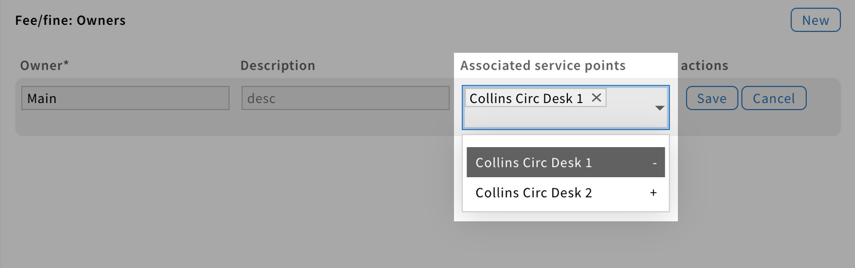
Multi-select component
A multiselect field allows users to select several options from a list.

Structure
A multiselect field is a text field with a caret icon on the right.
Generally, it has a label which indicates the type of input associated with the field.
Be aware: Placeholders should be avoided.

Behavior
When users click on the multiselect field, a dropdown window appears with a set of options.
Each option has a “+” or “-” icon, on the far right, to add or remove options.
When an option is added, it is displayed as a chip that can be removed by clicking on the X button or be toggled off in the dropdown.
If needed, the size of the field should adjust to show all selected options.
Style
Color
Since a multiselect is a clickable element, it has multiple states.
Each state is associated with a different color, providing visual feedback to users.


Shape
They are shown as rectangles with a 1px outline.