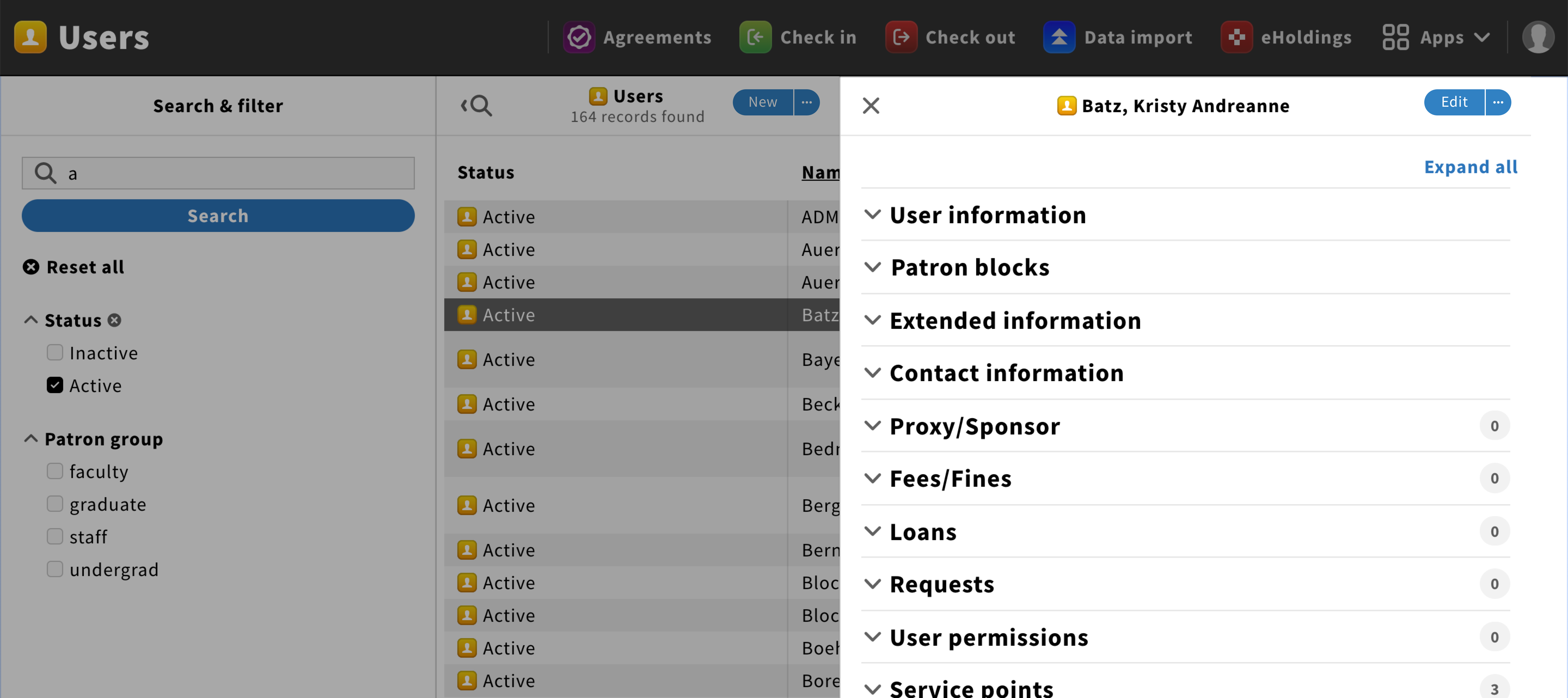
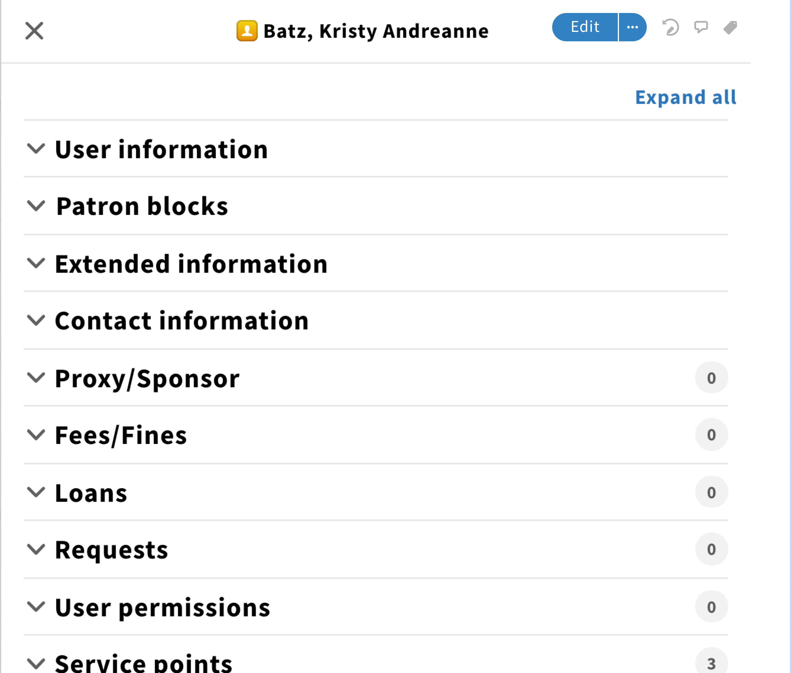
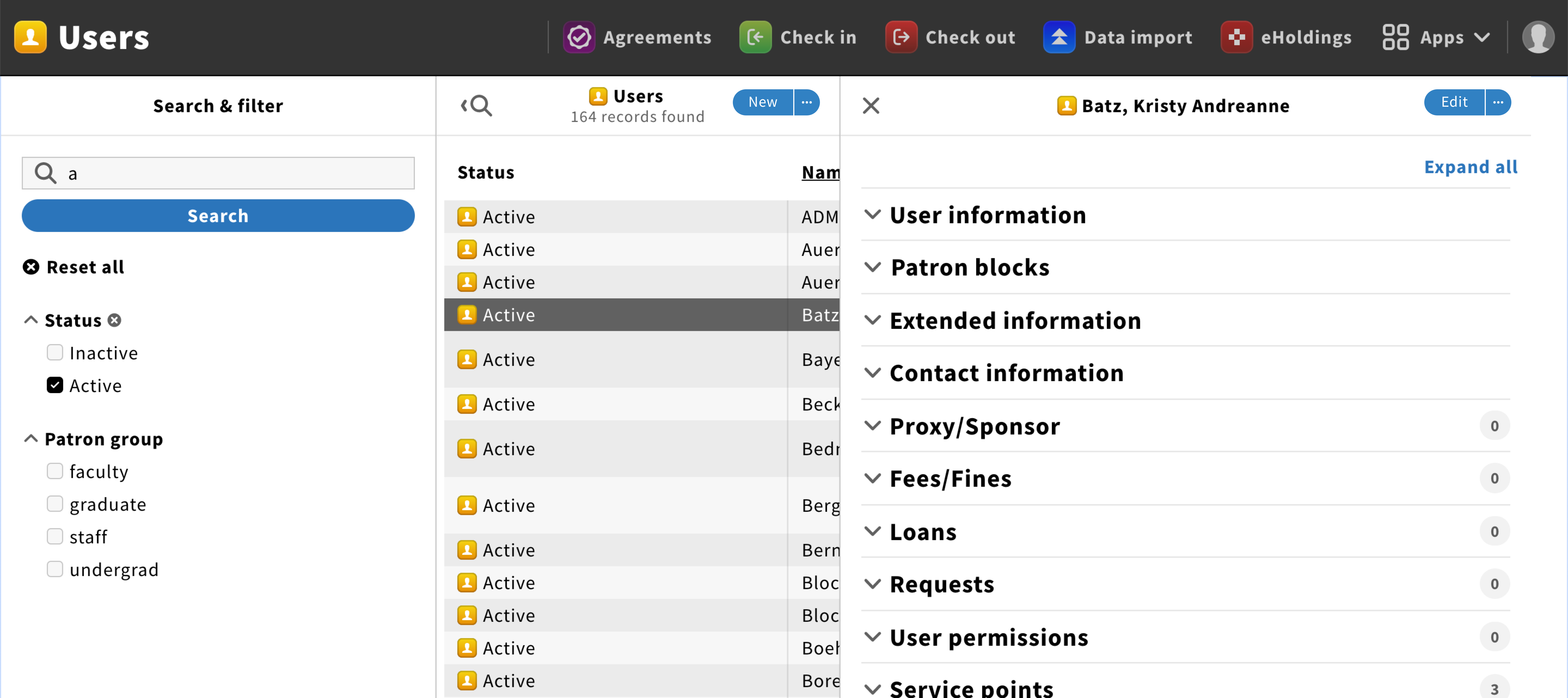
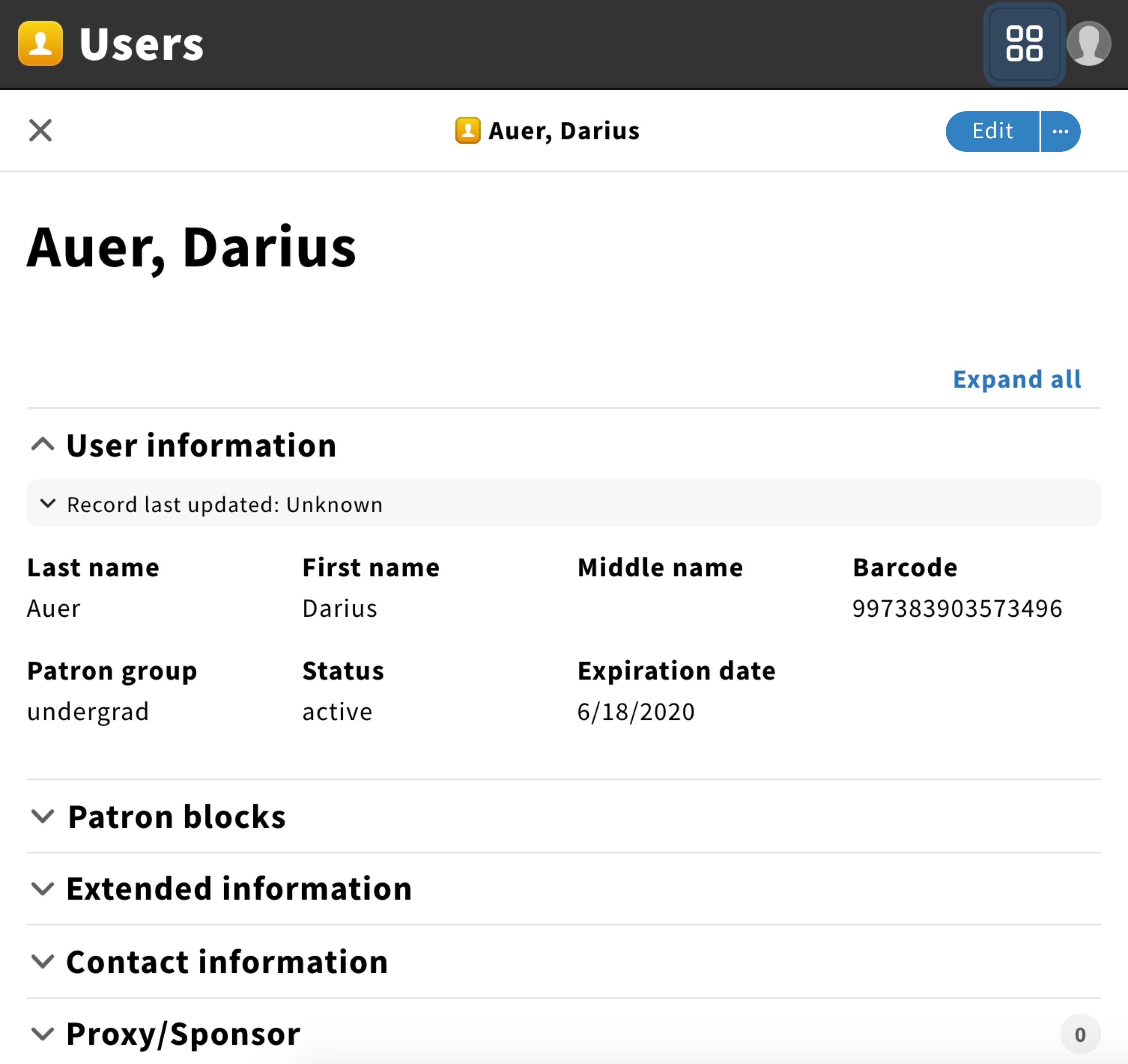
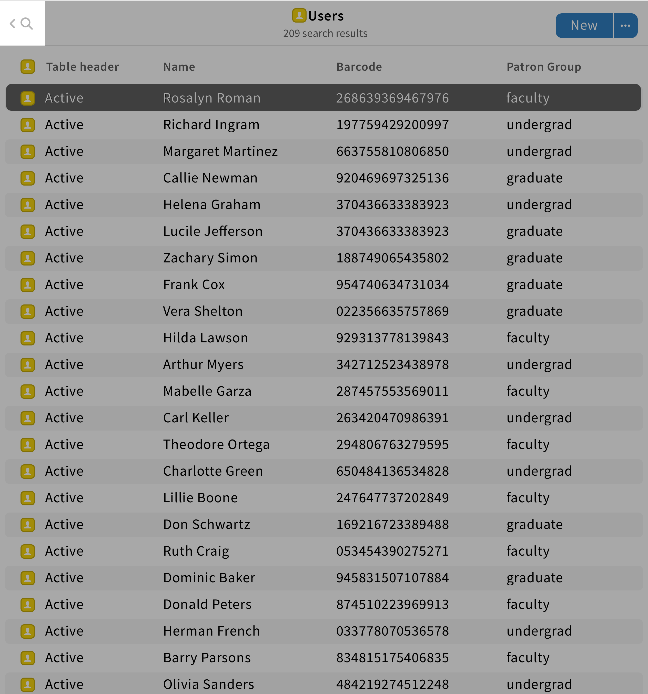
Pane component
A pane is a FOLIO core component that acts as a container to display information without cluttering the screen.
Structure
A pane is a core component generally composed of
- A pane header
- A pane menu
- A close/back icon
- Icon buttons
- A primary button
- Pane content
Responsive layout
Pane content shall be arranged into a 12 columns grid layout, allowing it to be responsive when the pane resize
When the screen width is wider than 800px, panes shall appear next to each other.
When the screen width is lower than 800px, only the most recent pane shall be displayed.
Behavior
When a new pane appears, it slides flex-end while the other panes resize.
To go back/close panes, users can click on the back/close icon found on the top left.
Be aware: No back/close icon should be used for the result pane. Instead, an arrow with a search icon should be placed to hide/show the search pane.
If users click on the primary button found in the pane header, they will perform actions related to pane content.
Here are some examples of primary actions in FOLIO: “Edit”, “New”, “Save & close”.

If users click on an icon button found in the pane header, they will perform actions related to controlling the pane.
Here are some examples of icon buttons are “Tags, “Close”.