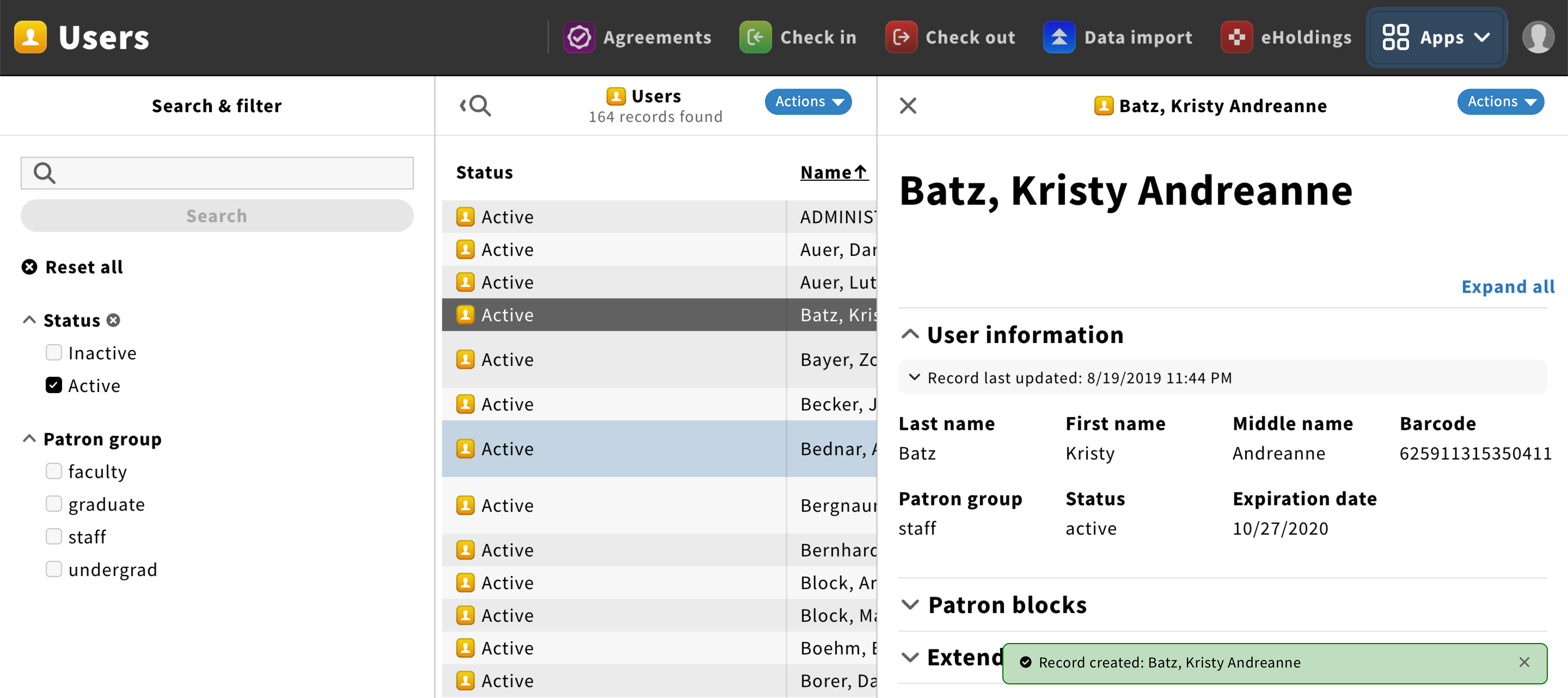
Callout component
A callout is a self-dismissing bar used to give users non-critical info about action status within an app or another app: record created, file deleted, instance updated, data imported…
Structure
Callouts should have a success/error icon, a short message and a close icon.
The message should be short and updates users on an action that have been performed. It should have the following format: {Type of action}: {Name of the content where action occurred}.

Location & size
Callouts appear at the bottom right of the screen and shall take less than 50% of the screen for desktop.
Behavior
Callouts slide from the left when non-critical information needs to be shown to users.
The information displayed in callouts should be relevant in the short term only and non-critical.
If users do not click on the “X” icon to dismiss callouts, they should slide down automatically after a period of time: 6 seconds if there are no action links, 10 seconds for toasts with links (Time can be customized).
Timing stop if users hover callouts.
If several toasts are needed, they should appear on top of each other.
Style
Callouts are rectangles with 6px corner radius and a 1px outline.
The background color can be either green (success) or red (failure), providing visual feedback to users.

