Button component
A button is a clickable component that triggers an action when pressed.
Structure
A button shall only contain a short and descriptive label, stating what will happen on press and giving users confidence in selecting the right action.

Go to the “Action language” section to have more info about button label and pick the right wording for your button.
Type of buttons
Classic button
It is the most often used button. Also, its height makes it a perfect fit for pane headers.

Button with a dropdown menu
This button allows you to have primary actions hidden under a menu dropdown.

Maxi button
It is almost twice the size of the classic button, making it more finger friendly.

Full-width button
Its width will take the app pane, making it impossible to miss.

Behavior
By clicking on a button, users can perform the corresponding action.
Style
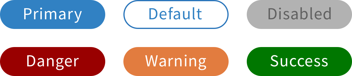
Color
Since a button is a clickable element, it has multiple states.
Each state is associated with a different color, providing visual feedback to users.
Format
Buttons are shown in a rectangle format with a corner radius of 100%.
Save buttons
Styles
When a new record is being created and when an existing record is being edited, it is suggested that the form should have two save buttons:
“Save” – a secondary button to enable users to quickly save work in progress without closing the form (formerly “Save & keep editing”).
“Save & close” – this is the primary save button currently used by all apps.
