Text field component
A text field allows users to enter, read and edit text.

Structure
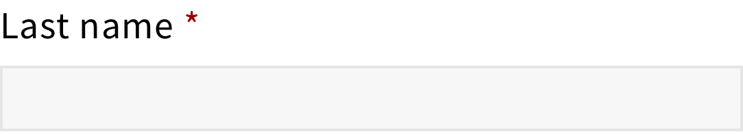
The text field is a single line text input.
It has an area to enter text and it can have a label to indicates the type of input associated with the field.

For a required text field, a red asterisk should be added next to the label.
For a read-only text field, a lock icon should be added next to the label.

In general, text fields should avoid placeholder but, if more details are needed to avoid input errors, placeholders should be used. For instance, text fields used as filters should always have placeholders to indicate what content users can filter.

Behavior
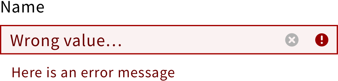
When users click on a text field, the field should become active and a clear icon should appear if the field has an input.

If the text entered is longer than the field, the font size should adjust to fit the field.
If needed, a spinner can be added to show that the text field is loading.
Style
Color
Since text fields are clickable elements, they have multiple states.
Each state is associated with a different color, providing visual feedback to users.


Shape
They are shown as rectangles with a 1px outline.