Nav list component
A nav list is a list of links allowing users to quickly navigate and select an item.
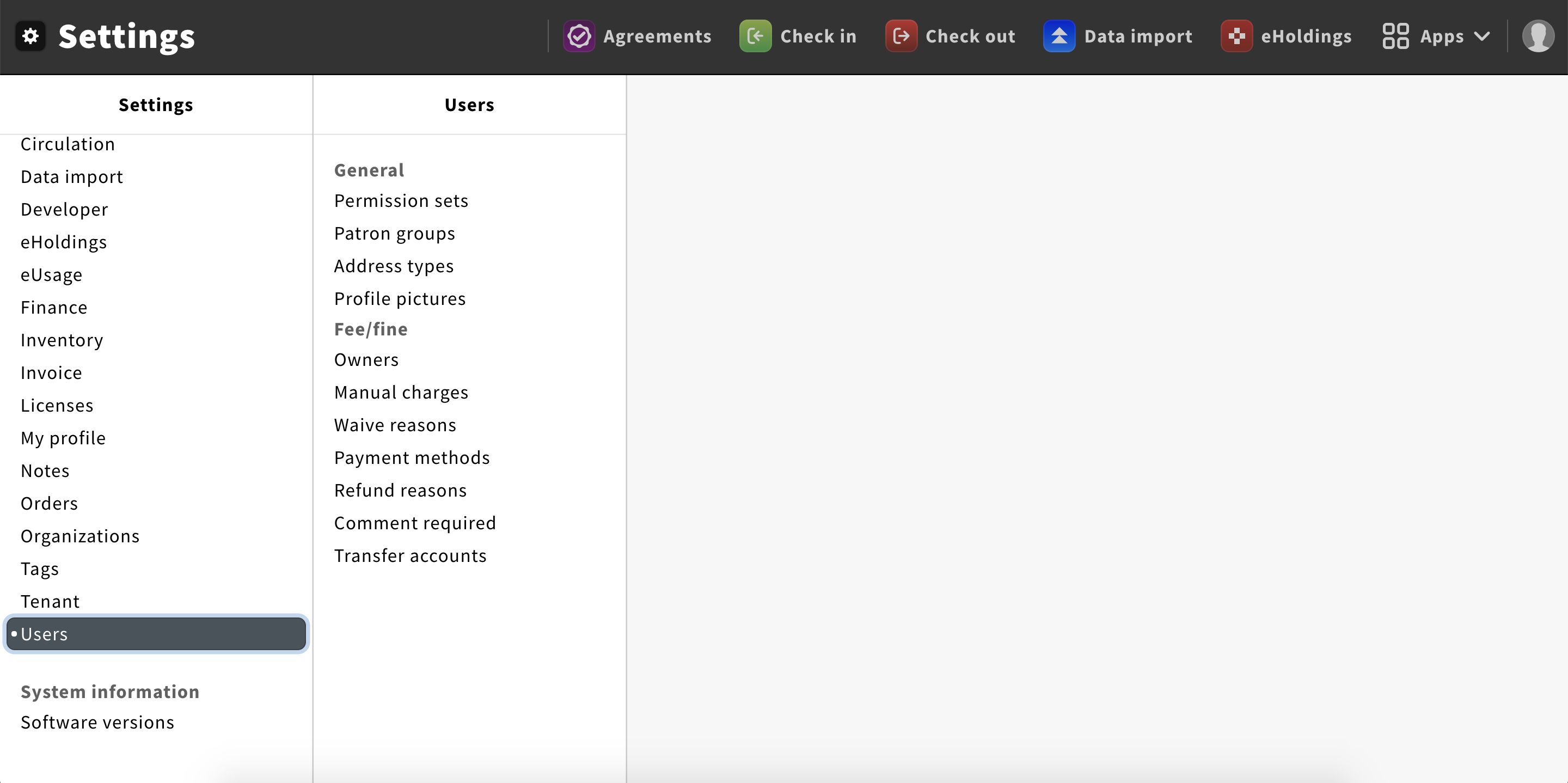
Structure
A nav list displays a set of links vertically.
Items of the list can be text + icon or only text.
To divide the list into sections, headlines can be used.
Be aware: If a headline is used for one section, all the remaining sections should have headlines as well.
Good example
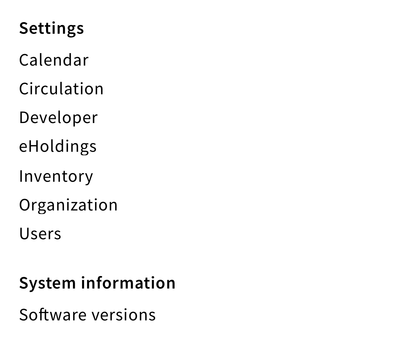
Each section has a headline
Bad example
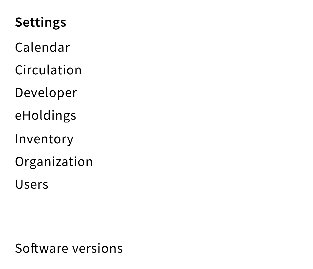
Only the first section has a headline
Behavior
Display list
By default, list items are sorted alphabetically.
If no list items are available, the following message should be displayed: “No items to show”.
Select an item
When users select an item, the background color changes to a darker grey. It allows users to know which item is selected.