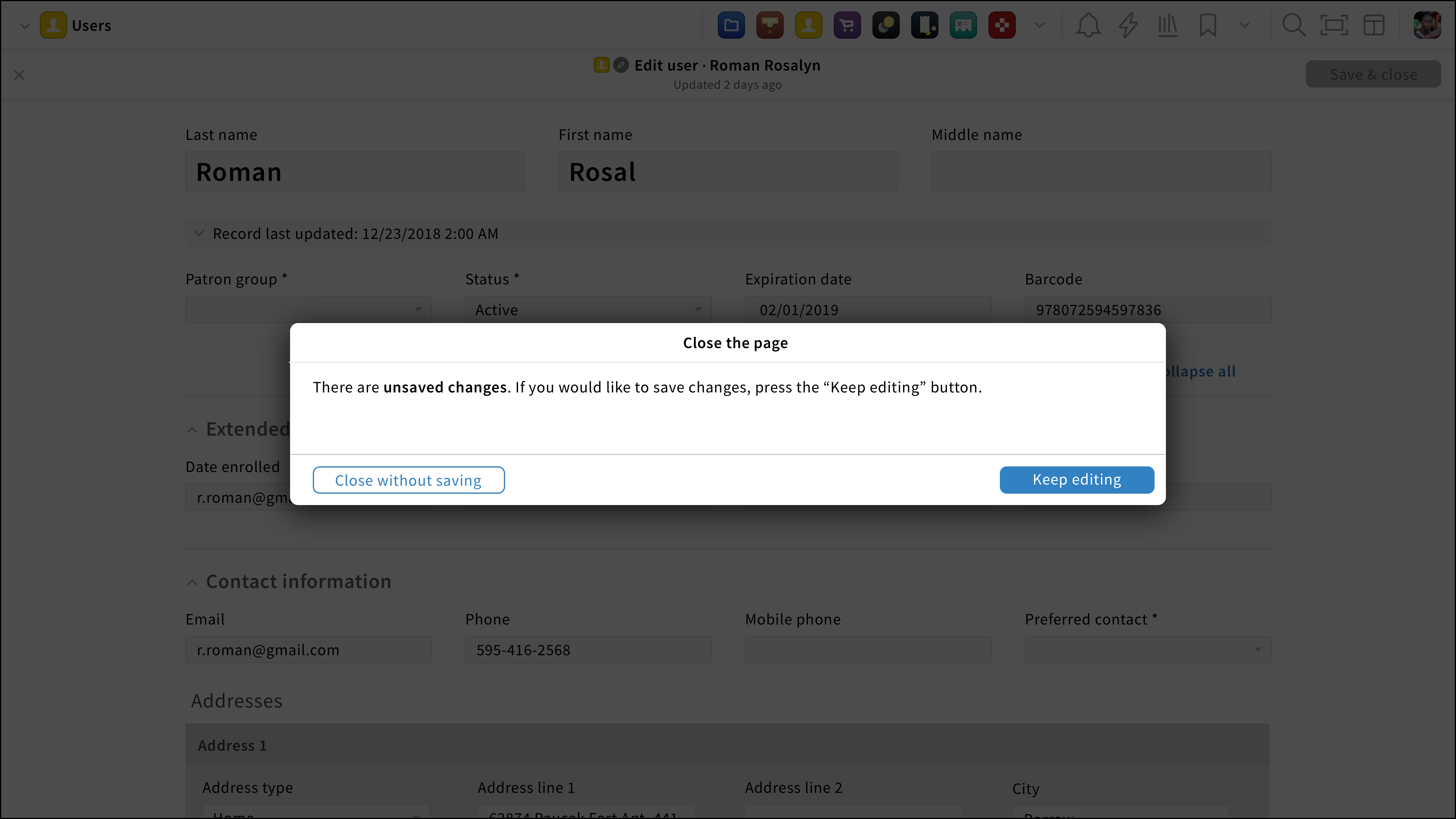
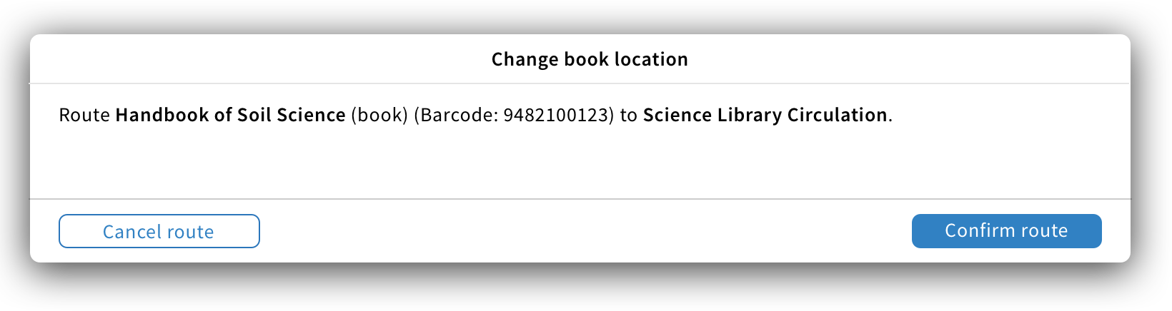
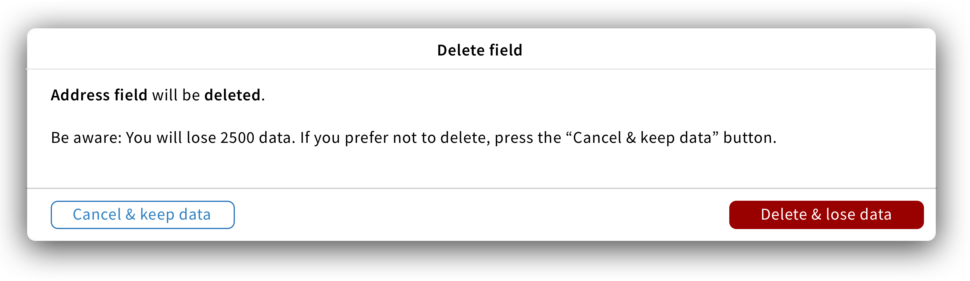
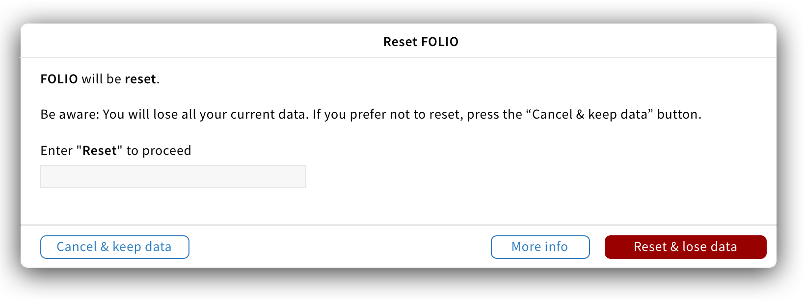
Confirmation modal UX pattern
A confirmation modal is a type of modal that asks users to verify if they would like to proceed with an action.
Structure
Title: The title states what action users are about to do. It should be short, descriptive and always start with a verb.
Examples: “Close the page”, “Change book location”.
Content: The content is short and states what will happen if users proceed with the action.
Button: A minimum of two buttons (one primary and one default) should be placed. The primary button should be located on the right-hand side while the close default button should be on the left-hand side of the modal. Below are the 3 main rules to follow for confirmation modal buttons:
- Labels summarize what will happen on click. So instead of labelling buttons “Confirm” and “Cancel” use the following format “Confirm {type}” and “Cancel {type}”.
- In the case of a cancelling confirmation modal, buttons should be labelled as follow: “Cancel {type}” and “Keep {type]”.
- If secondary actions are needed, buttons in the default style should be added next to the primary button.

Warning modal: For dangerous operations, a warning modal should be used. The primary button should have a danger style and label as follow: {Action verb} & {what will happen}. The default button should allow users to close the modal and cancel the action. The label should follow this format: {Cancel} & {what will happen}.
Behavior
When an action has been performed, the confirmation modal appears.
Since modals display important information, they aren’t dismissable, users consciously dismiss them by clicking on the close/cancel button or choosing another action.