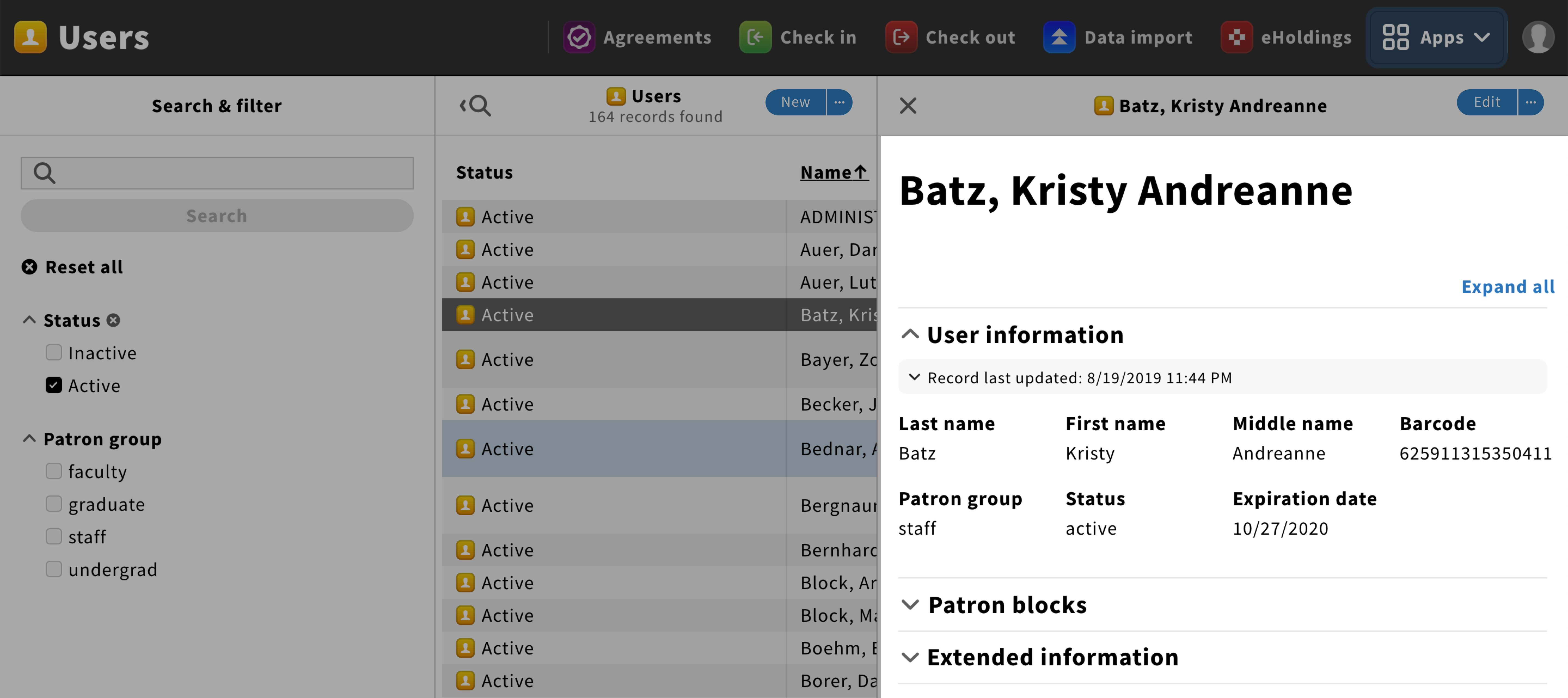
View record UX pattern
The Record pane shows detailed information about a selected result.

Structure
Pane header
The pane header should have a left close icon to close the pane and the title should follow this format: {Record type icon} {Record type} • {Record’s primary identifying characteristics}{Last updated} • {secondary identifying characteristics}.
An “Edit” button in the primary style should be added on the right to edit content. This button could also have an ellipsis icon to access the pane menu.
If needed, app icons can be added for any actions related to controlling the pane.
Content
The main information should be located in the accordion core info component.
Below it, details information should be organised under categories using the accordion component. Right above this section, an expand/collapse link should be added on the far right.
Behavior
General
When clicking on a result item, the Record pane should slide from the right.
Hide/show content
Users should be able to hide/show all the content of this pane by clicking on the collapse/expand link.
When collapsed, badges can be used to indicate the number of items found in an accordion section.
If only one specific information inside an accordion needs to be hide/show, a hide/show link should be used next to this information.

End of content
A fleuron should be used to marks the end of the content.