Edit record UX pattern
The edit record page allows users to select, edit, add and delete fields.
Structure
“Edit” button
An “Edit” button, in the primary style, shall be placed on the right side of a pane header to make it editable.
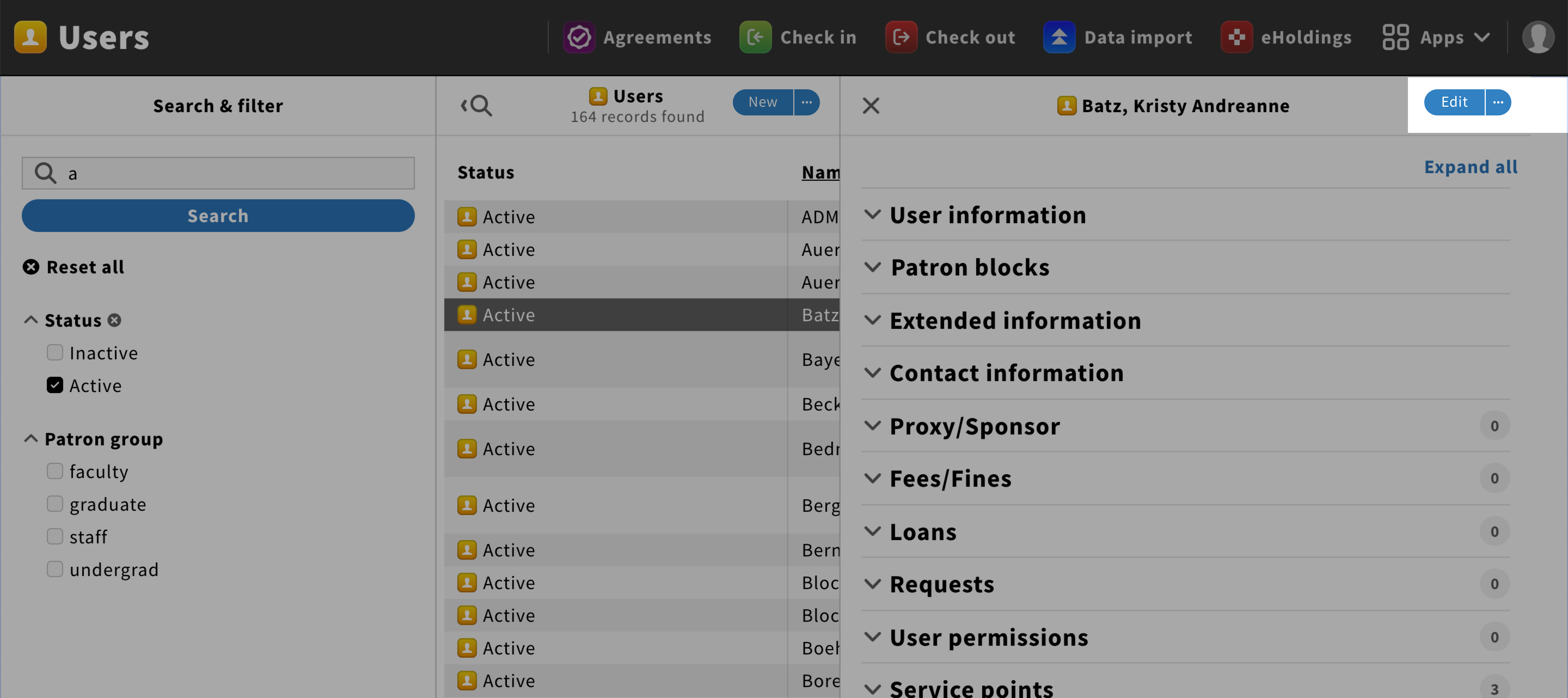
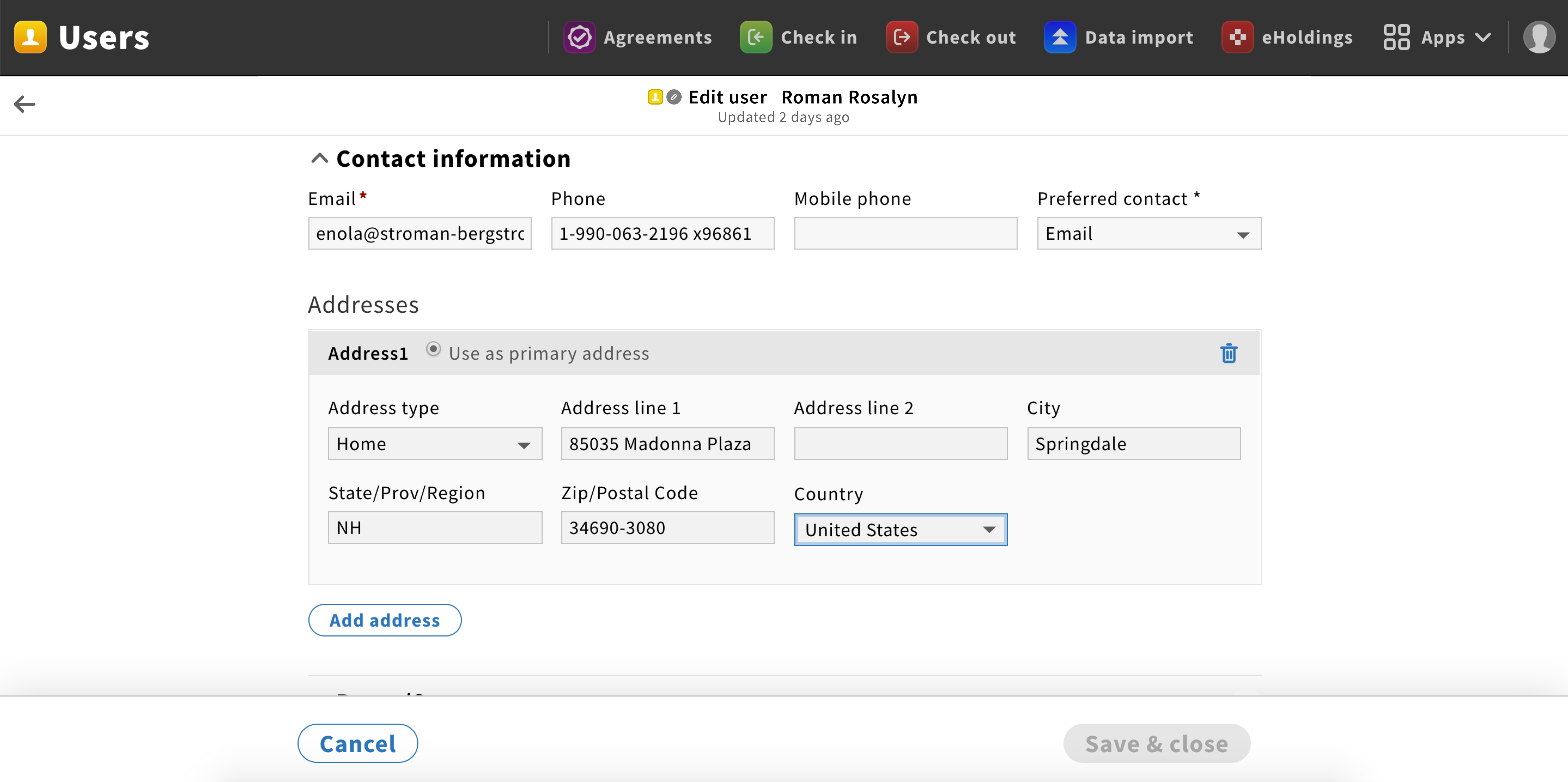
Pane header
The pane header is composed of a back arrow icon on the left and a title with the following format: {Record type icon} {Record type} • {Record’s primary identifying characteristics} {Last updated} • {secondary identifying characteristics}

Content
The content is a form with a layout similar to the selected record. Placeholders in fields should be avoided.
Pane footer
A sticky pane footer should be added with “Save & close” as a primary button and “Cancel” as a default button.
Behavior
General
When users click on an edit button, they shall be redirected to the edit record page. When they start editing, the “Save & close” button changes from the disabled to the primary style.
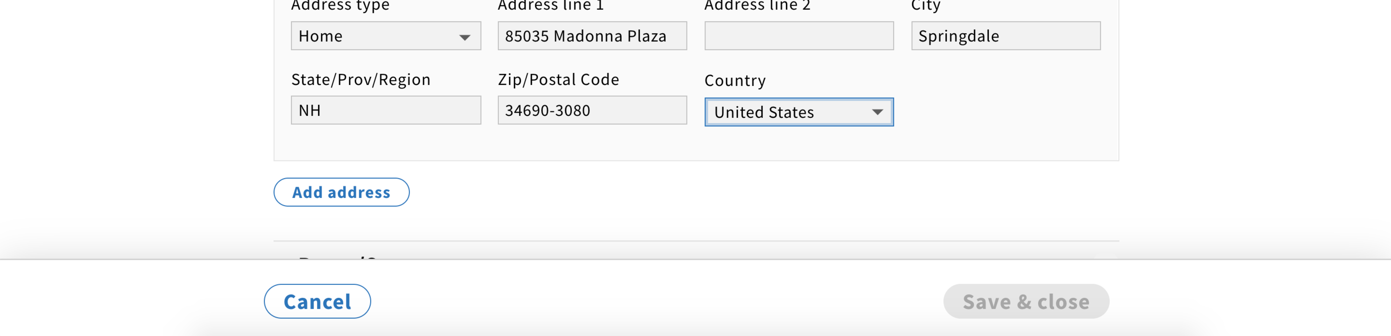
Adding & deleting
Users might be able to add text fields by clicking on the “Add {category name}” button in the default style. They shall also be able to delete a field by clicking on the delete icon next to it.
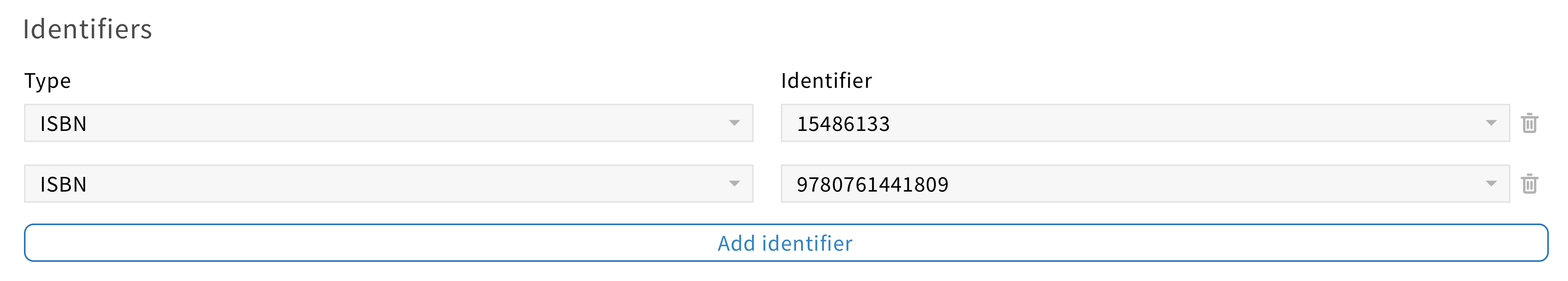
When a multi-column list is used in an edit screen, a delete and add icon could be added at the end of each list items so users could perform those actions in a quick and easy way.

Error
If users click on the “Save & close” button without filling all mandatory fields, those fields will have an error style.
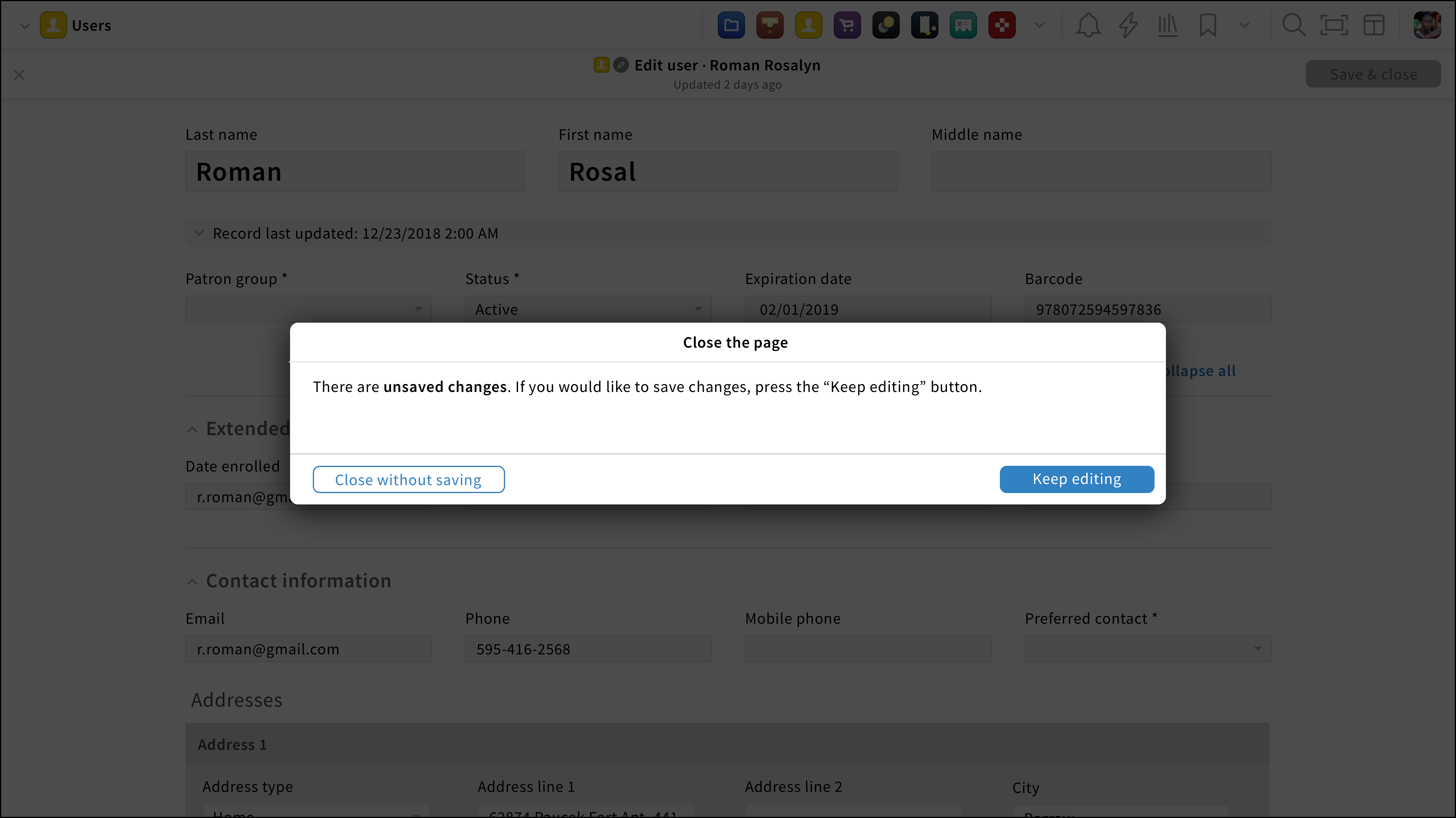
Cancelling changes
If users would like to cancel changes, they can click on the cancel option found in the pane footer.
If changes have been made, the unsaved changes modal shall appear no matter how users try to leave the page (by clicking on the close icon, the cancel option or a FOLIO navigational element).
Saving changes
When users save the record, they are redirected to the previous page with the updated record pane is visible.