Results pane UX pattern
The result pane shows the results of the Search & filter pane.

Structure
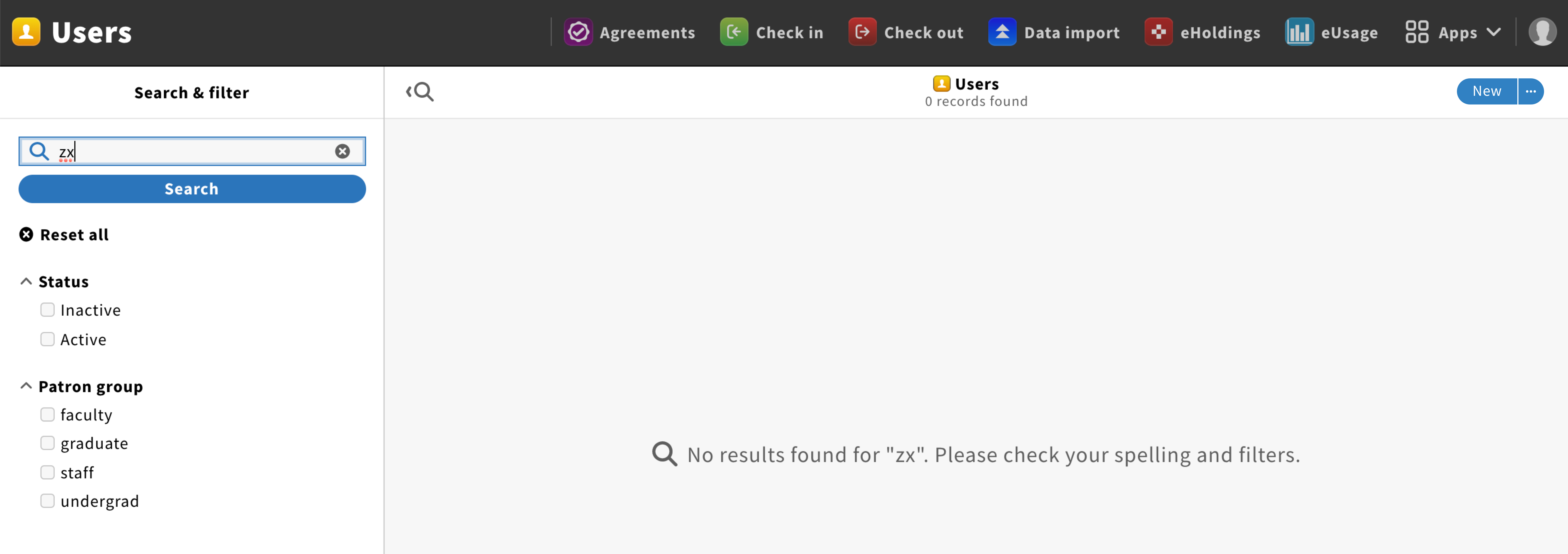
Pane header
The pane header should have a “New” primary button, on the right, to create a new record. This button could also have an ellipsis icon to access the pane menu.
On the left, a search icon with a left arrow should be displayed, allowing users to hide/show the Search & filter pane.
The pane title should have the following format: {Record type icon} {Record type, plural} {Record quantity} + total

Content
Search results should be displayed using the multi-column list component.
Behavior
No result list by default
For apps that deal with private information (e.g. Users app) or are search focused (e.g. Codex app), no result list should be displayed by default when opening an app. Instead, the result pane should display the following message: “{Arrow pointing toward the search & filter pane} Choose a filter or enter a search query to show results.”
Result list visible by default
For apps that deal with personal content (data created by you or your team), a result list should be displayed by default when opening an app.
Start a query
When users start a query in the Search & filter pane, the result list should be refound accordingly.
When there are no results found, the following message should be displayed: “{Search icon} No results found for “{keyword}”. Please check your spelling and filters.
Performing actions
The list menu, located under the pane menu dropdown, allows users to perform actions on items and customize the list.

End of content
A fleuron should be used to marks the end of the result list.