Dropdown component
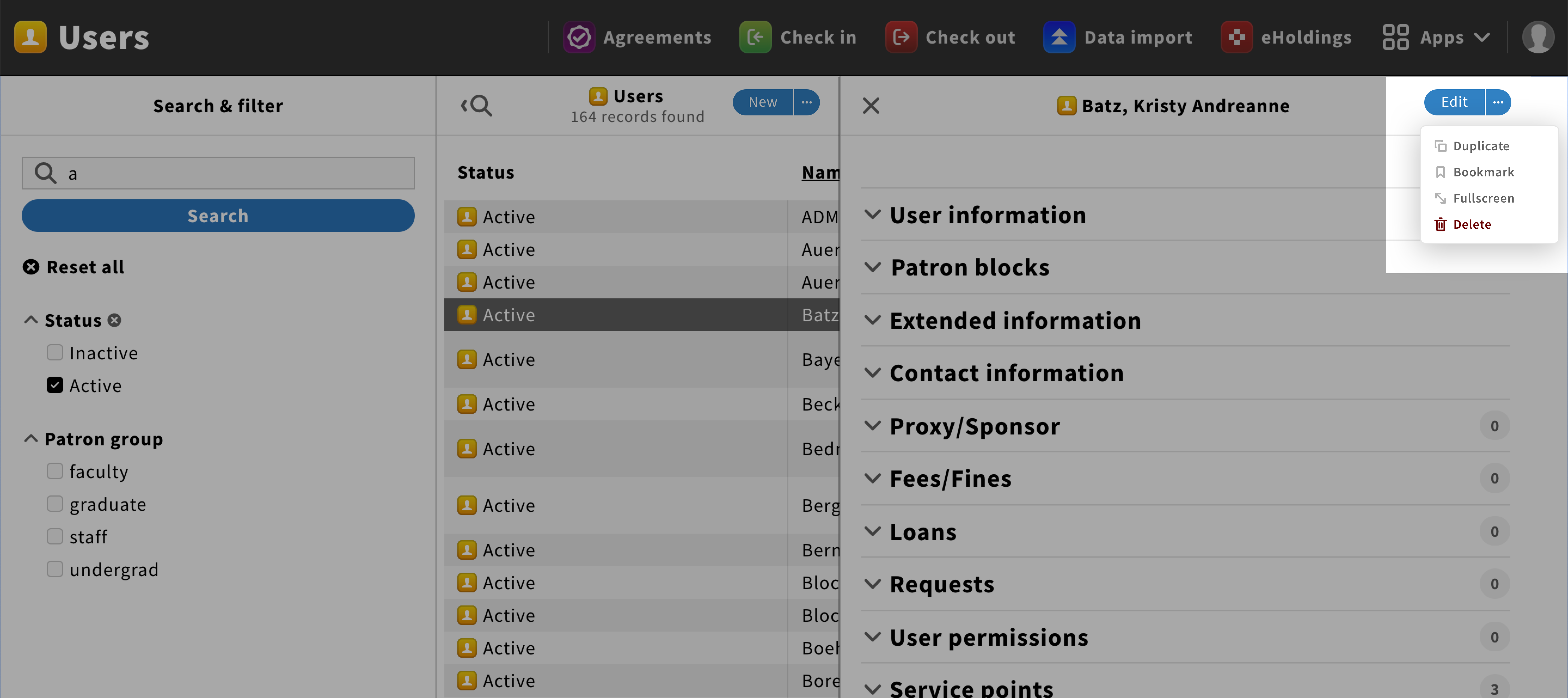
A dropdown allows users to see information or choose a list item from an overlay window. It can be used to display the menu of a pane.
Inventory app with dropdown
Structure
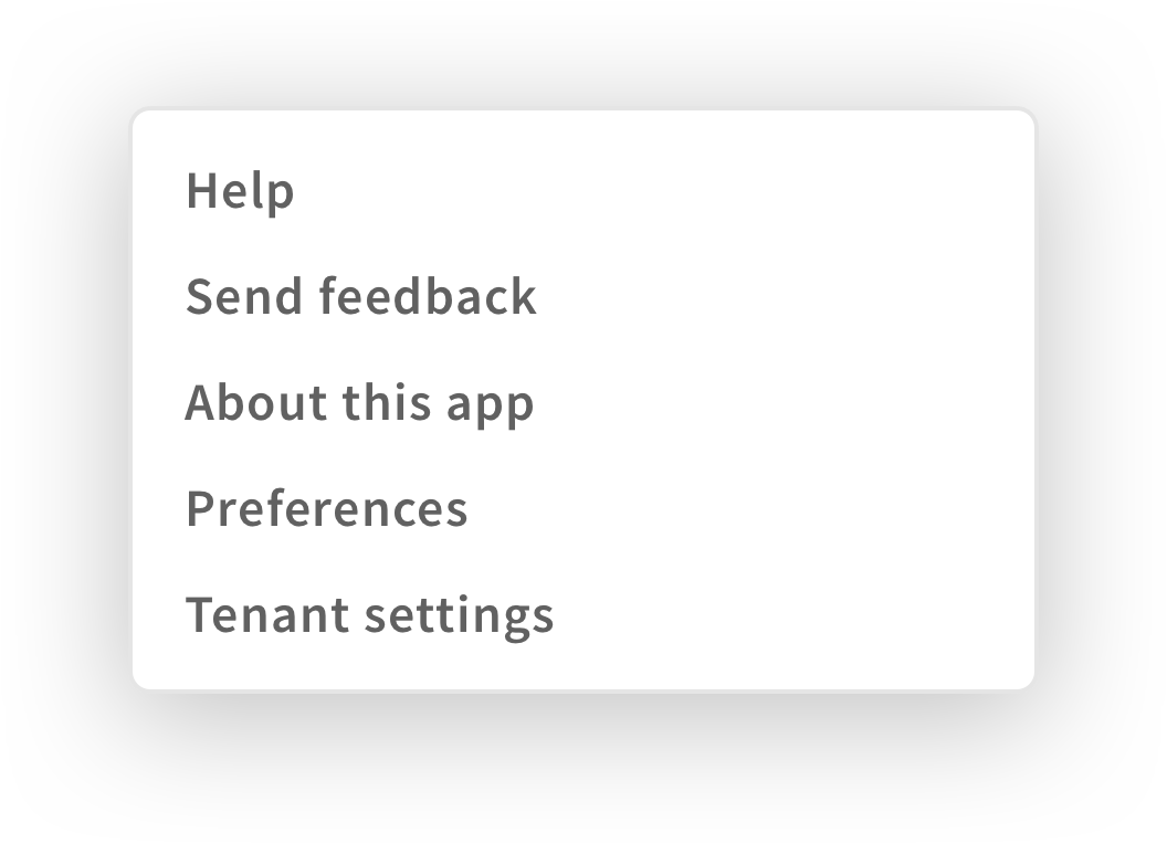
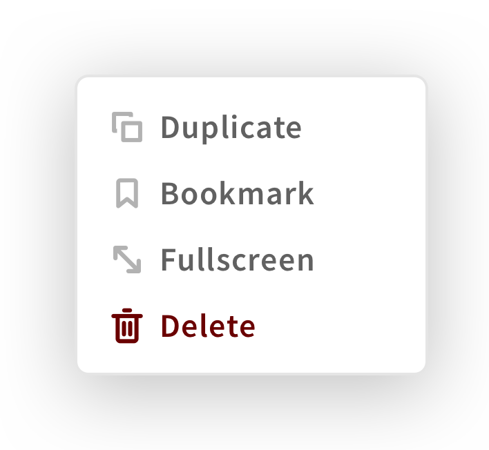
A dropdown is an overlay window that displays lists or action links.
If different sections need to be shown, each section should have a label.
View “Menu section” for more information.
If a dangerous action is added, It should be in red and at the end of the list.
Behavior
When users toggle a dropdown, the overlay window shall appear below the element that generates it.
If users click on a dropdown item or anywhere outside the window, the dropdown shall disappear.
Style
Dropdowns are squares with a 1px grey outline and 4px corner radius. To make them stand out from the rest, they shall have a shadow.


