Warning message language
Text field
The warning message should be short and give clear instructions on how to fix it. The message should always start with the field label.

Message banner
The message should be short and give clear instructions on how to fix the issue. It should follow this format: “{Warning icon} + Warning: {warning type}.”
Key information should be bold.

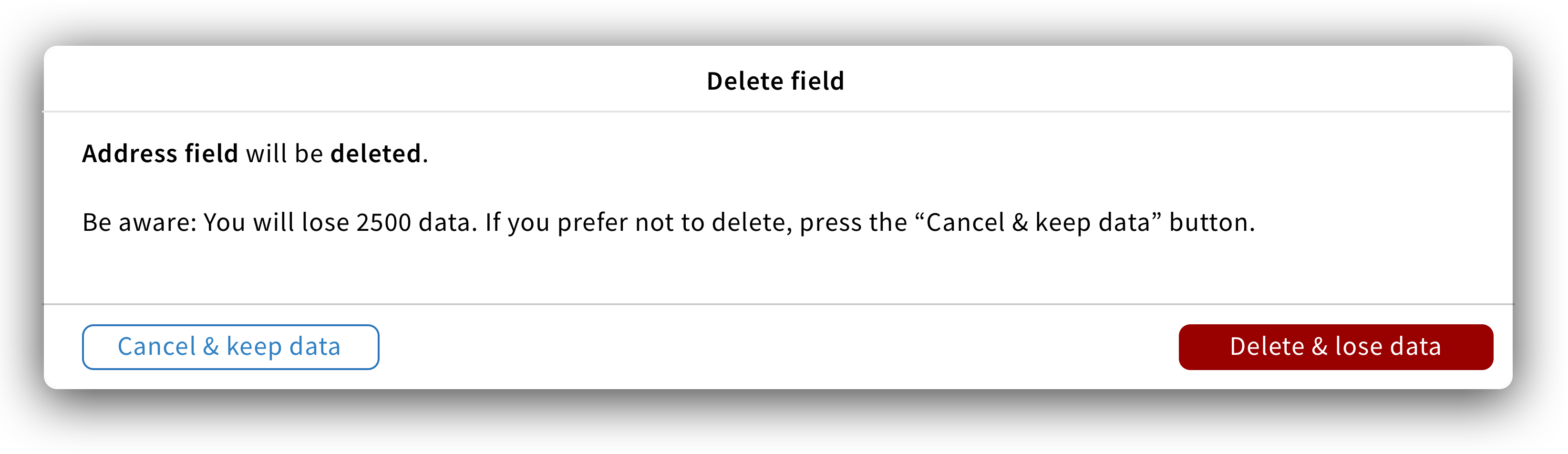
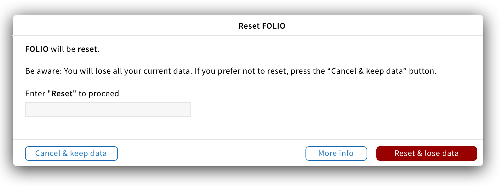
Data loss warning
When an action can result in data loss, a modal in the danger style should be used to warn users.
It should follow the following language rules.
Title: The title states what action users are about to do. It should be short, descriptive and always start with a verb.
Content: The first line states what will happen if users proceed with the action and should follow this format: “{Item} will be {action}“. The second line should warn users about data loss and should follow this format: “Be aware: You will lose {number of data loss}. If you prefer not to reset, press the “Cancel & keep data” button.
Button: “Cancel & keep data” and “{Action verb} & lose data”
For dangerous operations, an extra confirmation step should be added, asking users to type the action they would like to perform before confirming. The label of this field should state: “Enter “{Action verb} to proceed.
Other warning modals
For any other warning modals, please follow the following language rules.
Title: The title states what action triggered the warning. It should be short, descriptive and always start with a verb.
Content: The content should warn users about a condition that might cause a problem in the future and give them a solution to fix it. Key information should be bold
Button: The primary button should have a danger style and label as follow: {Action verb} & {what will happen}. The default button should allow users to close the modal and cancel the action. The label should follow this format: {Cancel} & {what will happen}.