Mouse interaction guidelines
When users interact with a clickable element, they shall be provided with visual feedback.
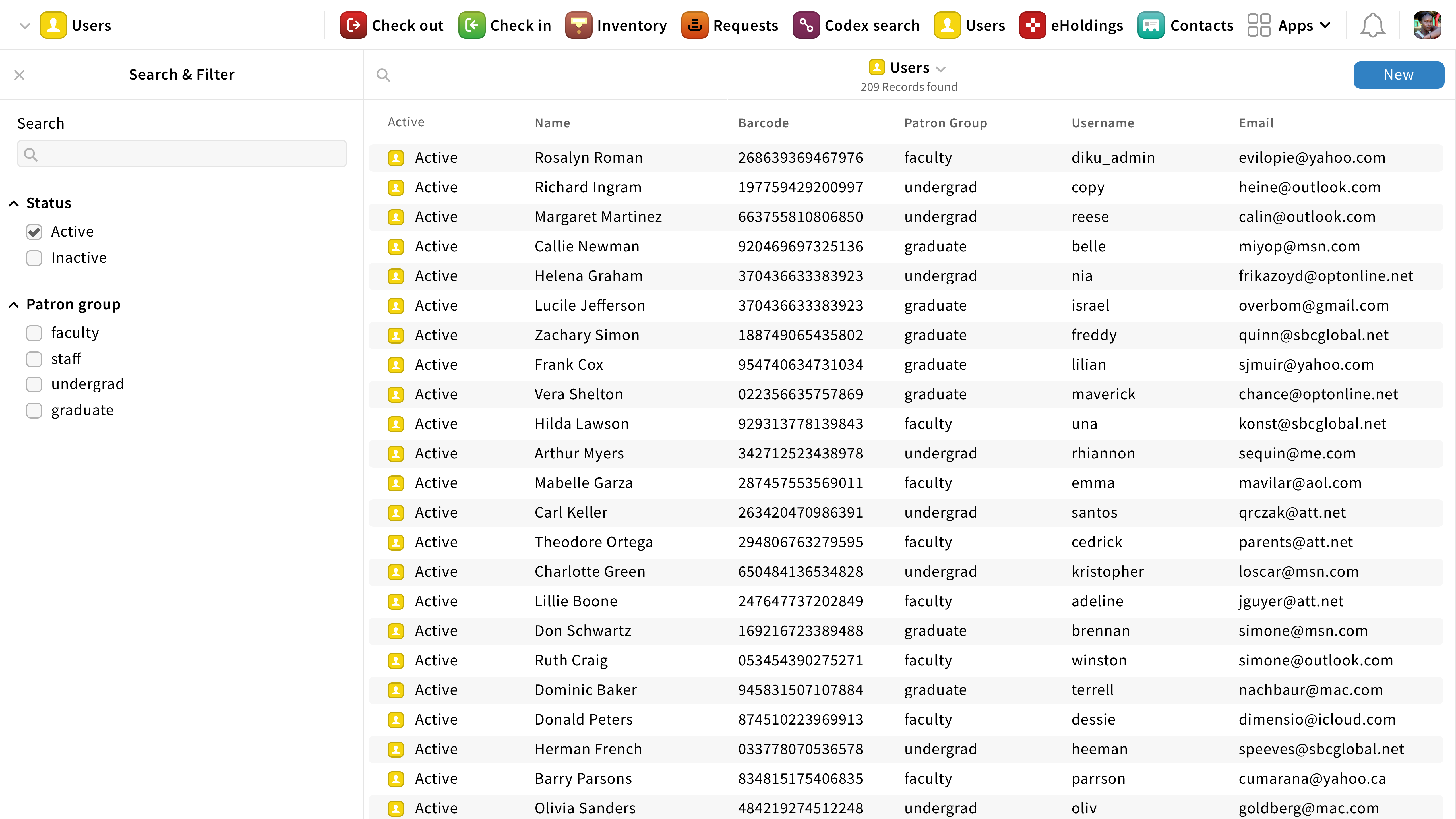
Users app with hover style
Hover
When users hover over a clickable element, the background turns light blue.
Focus
When users focus on a clickable element, the background turns bright blue with a light blue outline and a white dot on the left side.
Active
When an element is active, the background turns dark blue with a light blue outline and a dot on the left side.
For app icons, the active state is shown with a blue top bar only.
If an element is not clickable, no visual feedback shall be provided.


