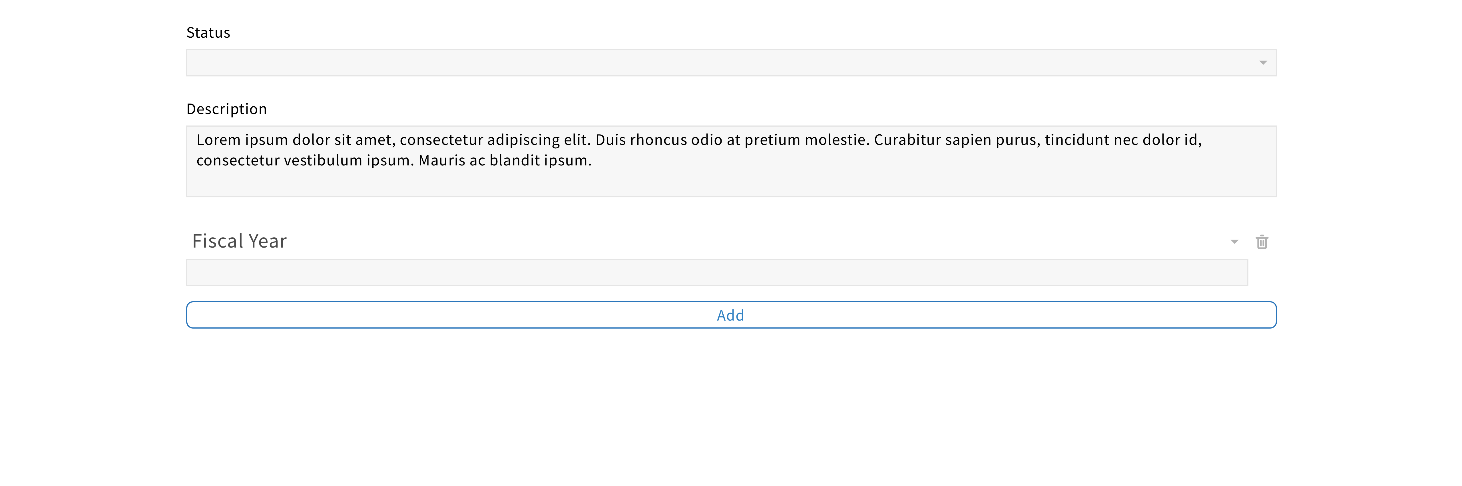
Text area
A text area allows users to enter, read and edit text.
Structure
The text area is a multiline text field.
Generally, it has a label which indicates the type of input associated with the field and an area to enter text.
Placeholders should be avoided. If the field is empty, a “null” icon should be displayed as a visual indicator.

For a required text area, a red asterisk should be added next to the label.

For a read-only text area, a lock icon should be added next to the label.

Behavior
When users click on a text field, the field should become active.

If the text entered is longer than the field, the font size should adjust to fit the field.
Style
Color
Since the text area is a clickable element, it has multiple states.
Each state is associated with a different color, providing visual feedback to users.


Shape
They are shown as rectangles with a 1px outline.